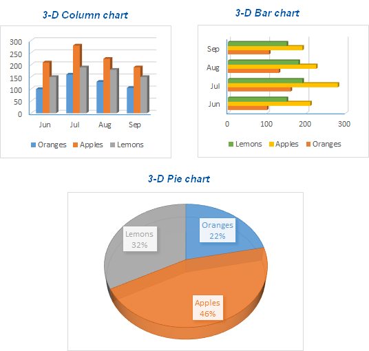
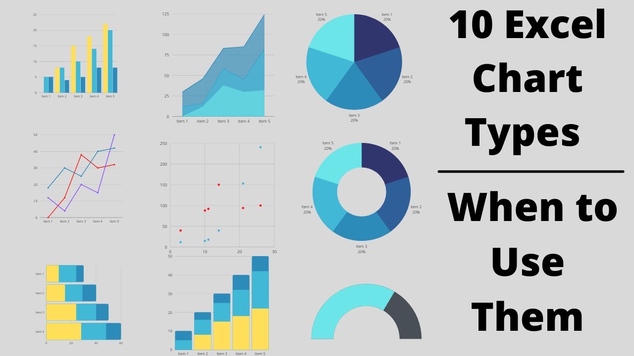
Excel offers various chart types, including Column, Line, Pie, Bar, Area, and Scatter charts. Each chart type serves distinct data visualization needs.
Excel charts transform raw data into visual insights. They help users quickly grasp complex information. Column charts compare values, while line charts track changes over time. Pie charts show proportions, and bar charts display data horizontally. Area charts emphasize volume, and scatter charts identify trends and correlations.
Choosing the right chart enhances data comprehension and decision-making. Excel’s flexibility enables users to tailor charts to their specific needs. Understanding these options empowers users to present data effectively, making Excel an essential tool for data analysis and visualization.
Introduction To Excel Charts
Excel charts help in visualizing data effectively. They make complex data easy to understand. With Excel, you can create various types of charts. These charts help in making informed decisions.
Importance Of Data Visualization
Data visualization is crucial for analyzing data. It helps in identifying trends and patterns quickly. Visualized data is easier to understand. It simplifies complex data sets. Charts make data comparison simple. They are essential for presentations and reports.
Excel Chart Basics
Excel offers many chart types. Each chart type has a unique purpose. Understanding these basics helps in choosing the right chart.
- Column Charts: Best for comparing data points across categories.
- Line Charts: Ideal for showing trends over time.
- Pie Charts: Useful for showing proportions.
- Bar Charts: Good for comparing different groups.
- Scatter Charts: Perfect for showing relationships between variables.
To create a chart, select your data first. Then choose the chart type from the Insert tab. Customize the chart with titles, labels, and colors.
| Chart Type | Purpose |
|---|---|
| Column Chart | Compare data points across categories |
| Line Chart | Show trends over time |
| Pie Chart | Show proportions |
| Bar Chart | Compare different groups |
| Scatter Chart | Show relationships between variables |
Column And Bar Charts
Excel charts help visualize data clearly. Column and Bar Charts are popular for representing data. They are easy to read and understand.
When To Use Column Charts
Column Charts display data changes over a period. They are ideal for showing trends. Use them to compare different categories.
- Track monthly sales.
- Compare yearly performance.
- Visualize survey results.
Column charts are vertical. Each column represents a data point. The height of the column shows the value.
Bar Charts For Comparisons
Bar Charts are similar to column charts. They are horizontal. Use them to compare different items. They are useful when labels are long.
- Compare product features.
- Analyze survey feedback.
- Show demographic data.
Bar charts make it easy to see differences. They are great for side-by-side comparisons.
| Feature | Column Chart | Bar Chart |
|---|---|---|
| Orientation | Vertical | Horizontal |
| Best For | Time series data | Comparing categories |
| Space Efficiency | Better with fewer categories | Handles long labels well |
Line And Area Charts
Excel offers a variety of chart types, each with unique features. Among these, Line and Area Charts stand out for their ability to display data trends over time. These charts are especially useful in tracking changes and comparing data sets.
Tracking Trends With Line Charts
Line charts are perfect for showing trends over intervals. They connect individual data points with straight lines. This makes it easy to see increases, decreases, and patterns.
To create a line chart, follow these steps:
- Select your data range.
- Go to the Insert tab.
- Choose Line Chart from the Chart options.
Line charts are ideal for:
- Sales figures over months.
- Temperature changes by day.
- Website traffic over weeks.
Visualizing Data With Area Charts
Area charts fill the space beneath the lines. This highlights the volume of data. They are useful for emphasizing the magnitude of changes over time.
To make an area chart, you can:
- Highlight your data range.
- Navigate to the Insert tab.
- Select Area Chart from the options.
Area charts work best for:
- Showing total monthly rainfall.
- Visualizing quarterly revenue.
- Demonstrating cumulative data.
Both line and area charts provide clear visual insights. Choose the one that best fits your data needs.
Pie And Doughnut Charts
Excel charts are powerful tools for data visualization. Among them, Pie and Doughnut Charts stand out for their ability to represent data parts of a whole. They are easy to understand and visually appealing.
Parts Of A Whole With Pie Charts
Pie charts display data in a circular graph. Each slice represents a category’s percentage of the total. They are excellent for showing how each part contributes to the whole.
Here is an example of how a pie chart is structured:
| Category | Percentage |
|---|---|
| Category A | 25% |
| Category B | 35% |
| Category C | 40% |
- Easy to interpret
- Visually appealing
- Highlights proportions
Doughnut Charts For Enhanced Clarity
Doughnut charts are similar to pie charts but with a blank center. This space can hold additional information, such as total values.
Doughnut charts offer extra room for customization:
- They can show multiple data series.
- They provide better readability.
Here’s a simple comparison between pie charts and doughnut charts:
| Feature | Pie Chart | Doughnut Chart |
|---|---|---|
| Visual Style | Solid circle | Circle with center cut out |
| Data Series | Single series | Multiple series |
| Customization | Limited | High |
Using Pie and Doughnut Charts can simplify complex data. They make your presentation more engaging and informative.
Scatter And Bubble Charts
Excel offers various chart types to visualize data effectively. Among these, Scatter and Bubble Charts stand out for their unique capabilities. These charts help in identifying complex data relationships and adding multiple dimensions to your data visualization.
Identifying Relationships With Scatter Charts
Scatter charts are ideal for showing the relationship between two variables. They plot data points on an X and Y axis. Each point represents a data pair.
Use scatter charts to identify trends, correlations, or patterns in your data. For instance, you can see how sales figures change with advertising spend.
Here’s an example table for a Scatter Chart:
| Advertising Spend ($) | Sales ($) |
|---|---|
| 100 | 200 |
| 200 | 450 |
| 300 | 700 |
Adding Dimensions With Bubble Charts
Bubble charts build on scatter charts by adding a third variable. This third variable is represented by the size of the bubble.
For example, you could add profit margin as the third variable. The bubble’s size would then show how the profit margin changes with sales and advertising spend.
Here’s an example table for a Bubble Chart:
| Advertising Spend ($) | Sales ($) | Profit Margin (%) |
|---|---|---|
| 100 | 200 | 10 |
| 200 | 450 | 15 |
| 300 | 700 | 20 |
Bubble charts are useful for visualizing complex data sets with three variables. They help in making data-driven decisions by providing a clearer picture.

Credit: www.ablebits.com
Histogram And Pareto Charts
Excel offers various charts for data visualization. Histograms and Pareto charts are two powerful types. Both help in analyzing data distributions and priorities. Let’s explore their features and uses.
Distribution With Histograms
Histograms visualize the distribution of numerical data. They show how often data points fall within certain ranges or bins. This is useful for understanding data frequency.
To create a histogram in Excel, follow these steps:
- Select your data range.
- Go to the “Insert” tab.
- Click on the “Histogram” chart icon.
Histograms help in identifying patterns and trends. For example, you can see if data is normally distributed or skewed.
| Feature | Description |
|---|---|
| Bins | Ranges of data values |
| Frequency | Number of data points in each bin |
Prioritizing With Pareto Charts
Pareto charts combine bars and a line graph. They help prioritize issues based on their frequency. The bars show individual values in descending order. The line shows the cumulative total.
Steps to create a Pareto chart in Excel:
- Select your data range.
- Go to the “Insert” tab.
- Click on the “Pareto” chart icon.
Pareto charts are useful for identifying the most significant factors. They follow the 80/20 rule, where 80% of effects come from 20% of causes.
For example, in quality control, you can identify the most common defects. This helps in focusing efforts on the most impactful areas.
Combo Charts
Excel offers various chart types for visualizing data effectively. One versatile option is the Combo Chart. This chart type allows combining different data sets into a single chart. It helps highlight relationships between different data series.
Combining Data Sets
Combo Charts are useful for displaying two or more types of data in one chart. For example, you can combine a Column Chart and a Line Chart. This combination can show sales and profit trends together.
To create a Combo Chart:
- Select your data range.
- Go to the Insert tab.
- Click on Combo Chart.
- Choose the chart type for each data series.
This process creates a chart that displays different data sets together. It provides a clear and comprehensive view of your data.
Customizing Combo Charts
Customizing Combo Charts in Excel is straightforward. You can change the chart type for each data series easily. Follow these steps:
- Click on the chart to select it.
- Go to the Chart Tools tab.
- Select Change Chart Type.
- Choose the desired chart type for each data series.
You can also adjust colors, labels, and legends. This customization helps match your chart with your presentation style. Here is a simple table for quick reference:
| Customization | Action |
|---|---|
| Change Chart Type | Chart Tools > Change Chart Type |
| Adjust Colors | Format > Shape Fill |
| Edit Labels | Chart Tools > Add Chart Element > Data Labels |
Combo Charts make data comparison and analysis easier. They are perfect for presenting complex data in a simple, visual format.

Credit: m.youtube.com
Advanced Chart Customizations
Excel charts are powerful tools for data visualization. Advanced chart customizations can make your charts more insightful and appealing. Let’s explore some techniques to enhance your Excel charts.
Adding Data Labels And Legends
Data labels provide specific values for data points. Legends help identify different data series. Adding these elements makes your charts easier to understand.
- Click on the chart to select it.
- Go to the Chart Tools menu.
- Select Add Chart Element.
- Choose Data Labels or Legend.
Customize the position and format of data labels and legends. This helps in better data interpretation.
Formatting And Styling Tips
Formatting and styling your charts improve their readability. Here are some tips to make your charts stand out.
- Use contrasting colors for different data series.
- Adjust the font size for better readability.
- Apply borders and shadows for a professional look.
- Use gridlines sparingly to avoid clutter.
Consistent formatting maintains a clean and professional appearance. Experiment with different styles to find what works best for your data.
Interactive Charts
Interactive charts in Excel allow users to engage with data. They provide dynamic visual insights. This makes data analysis easier and more efficient.
Using Slicers And Timelines
Slicers are visual filters for tables and pivot tables. They help users quickly filter data. Users can select or deselect items to see different data views.
- Go to the Insert tab.
- Click on Slicer.
- Select the fields you want to filter.
- Click OK to insert the slicer.
Timelines are similar to slicers but are used for date fields. They allow users to filter data over a period. This is useful for time-based data analysis.
- Go to the Insert tab.
- Click on Timeline.
- Select the date field you want to filter.
- Click OK to insert the timeline.
Incorporating Pivot Charts
Pivot Charts visualize data from pivot tables. They provide interactive data exploration. Users can drill down into data for detailed insights.
- Create a pivot table.
- Go to the PivotTable Tools tab.
- Click on PivotChart.
- Select the chart type you want.
- Click OK to insert the pivot chart.
Pivot charts update automatically when the pivot table data changes. This ensures the chart always displays the latest information.
| Interactive Feature | Function |
|---|---|
| Slicers | Filter data quickly |
| Timelines | Filter data over a period |
| Pivot Charts | Visualize pivot table data |
Interactive charts make data analysis more engaging. Users can explore data in a more intuitive way.
Conclusion And Best Practices
Understanding the types of Excel charts is essential. They help present data clearly. Different charts serve different purposes. Choosing the right chart enhances data visualization. Follow best practices to avoid common mistakes.
Choosing The Right Chart
Selecting the correct chart type is vital. Consider your data’s nature and the message you want to convey. Here are some guidelines to help:
- Bar Charts: Best for comparing different categories.
- Line Charts: Ideal for showing trends over time.
- Pie Charts: Great for displaying parts of a whole.
- Scatter Plots: Useful for showing relationships between variables.
Always preview your chart. Ensure it conveys the intended message clearly.
Common Mistakes To Avoid
Even with the right chart, mistakes can occur. Here are some common mistakes to avoid:
- Too much data: Overloading a chart makes it hard to read.
- Wrong chart type: Misleading information can result from this.
- Poor labeling: Labels must be clear and concise.
- Inconsistent scales: Ensure scales are uniform for accurate comparison.
- Ignoring color: Use colors wisely to enhance readability.
By following these tips, your charts will be more effective. Proper chart selection and avoiding mistakes improve data presentation.

Credit: insightsoftware.com
Frequently Asked Questions
What Are The Most Common Excel Charts?
The most common Excel charts include bar charts, pie charts, line charts, scatter plots, and histograms. Each type serves a specific purpose. Bar charts show comparisons, pie charts show proportions, line charts show trends, scatter plots show relationships, and histograms show distributions.
How Do I Choose The Right Excel Chart?
To choose the right Excel chart, first identify your data type and analysis goal. Bar charts compare categories, line charts show trends, pie charts display proportions, and scatter plots analyze relationships. Choose the chart that best represents your data’s message.
What Is The Use Of A Scatter Plot In Excel?
A scatter plot in Excel is used to show the relationship between two variables. It helps in identifying patterns, correlations, and outliers in the data. Scatter plots are ideal for data analysis and statistical modeling.
Can I Customize Excel Charts?
Yes, you can customize Excel charts extensively. You can change colors, add data labels, modify axes, and insert trendlines. Customization helps in enhancing the chart’s readability and visual appeal, making data interpretation easier.
Conclusion
Mastering various Excel charts can transform your data presentation. Choose the right chart to convey your message effectively. By leveraging these chart types, you can create visually appealing and insightful reports. Enhance your data analysis skills with Excel and make informed decisions swiftly.
Start exploring Excel charts today to elevate your data visualization.


