
Use slicers to filter data visually and create dynamic charts. Group data for better analysis and clarity.
Pivot charts in Excel offer powerful tools for data visualization and analysis. They allow users to filter, group, and present data dynamically. Mastering pivot chart tips and tricks can significantly enhance your data presentation skills. Slicers provide an intuitive way to filter data, making charts interactive.
Grouping data helps in summarizing information, making it easier to identify patterns. These features save time and improve accuracy in reporting. By leveraging these tips, you can create more effective and engaging pivot charts. This will lead to better decision-making and clearer insights from your data.
Introduction To Pivot Charts
Excel Pivot Charts are powerful tools for data visualization. They help users analyze data trends and patterns effortlessly. This section introduces Pivot Charts, explaining their benefits and uses.
What Is A Pivot Chart?
A Pivot Chart is a visual representation of data in an Excel Pivot Table. It allows users to create interactive charts. These charts update automatically when the Pivot Table changes.
Pivot Charts can display data in various forms like bar, line, and pie charts. They make it easy to visualize complex data sets. Users can filter, sort, and drill down into data.
Benefits Of Using Pivot Charts
Interactive Data Analysis: Pivot Charts let users interact with data. They can filter, sort, and drill down into specifics.
Automatic Updates: Pivot Charts update automatically with Pivot Table changes. This ensures data accuracy.
Versatile Visualization: Pivot Charts support various chart types. Users can choose the best way to visualize their data.
Enhanced Reporting: Pivot Charts make reports visually appealing. They help in presenting data effectively.
Incorporating Pivot Charts in your Excel work can greatly enhance data analysis. They provide clear and concise visual insights.
Credit: www.pk-anexcelexpert.com
Creating Your First Pivot Chart
Creating your first pivot chart in Excel can be exciting and rewarding. It helps you visualize data in a meaningful way. This guide will walk you through each step. Follow along to set up your data and insert your first pivot chart.
Setting Up Your Data
First, ensure your data is well-organized. Each column should have a header. Avoid blank rows or columns. Your data should look something like this:
Product | Sales | Region |
|---|---|---|
Apples | 120 | North |
Oranges | 150 | South |
Bananas | 100 | East |
Next, select the data range. Click and drag to highlight all cells. This is the data you will use for your pivot chart.
Inserting A Pivot Chart
Go to the Insert tab on the Excel ribbon. Click on PivotChart. A dialog box will appear.
Select New Worksheet to place the pivot chart on a new sheet. Click OK.
A blank pivot chart will appear. On the right, you will see the PivotChart Fields pane. Drag and drop fields into the Axis and Values areas. For example, drag Product to Axis and Sales to Values.
Your pivot chart will now display data. You can customize it by changing chart types or adding filters.
Experiment with different settings to find the best view for your data. Creating your first pivot chart is a straightforward process. Follow these steps to start visualizing your data effectively.
Customizing Pivot Charts
Customizing Pivot Charts in Excel can make your data stand out. Customizations help to highlight key insights and make your charts more readable. This section will cover tips and tricks for changing chart types and adjusting chart layout.
Changing Chart Types
Pivot Charts in Excel offer various chart types. You can choose the one that best suits your data. To change the chart type:
Click on your Pivot Chart.
Go to the Design tab.
Select Change Chart Type.
Choose from options like bar, line, or pie charts.
Different chart types can highlight different data aspects. Bar charts are good for comparing categories. Line charts show trends over time. Pie charts display parts of a whole.
Adjusting Chart Layout
Adjusting the layout of your Pivot Chart can make it more effective. Here are steps to adjust the layout:
Click on your Pivot Chart.
Go to the Design tab.
Click Add Chart Element.
Select elements like titles, labels, and legends.
You can also move elements around for better clarity. For example, place the legend at the top or bottom. Adjust data labels to show exact values.
Feature | Benefit |
|---|---|
Chart Titles | Clarify what the chart represents. |
Axis Labels | Explain the data points clearly. |
Legends | Make it easy to identify data series. |
Customizing your Pivot Charts helps to make your data more understandable. Use these tips to create clear, effective charts that communicate your data insights.
Advanced Formatting Techniques
Excel Pivot Charts are powerful tools for data visualization. But, to make your charts truly shine, you need to master Advanced Formatting Techniques. These techniques can transform your charts from plain to professional. Let’s dive into some advanced formatting tips that will enhance your Pivot Charts.
Using Conditional Formatting
Conditional formatting can make your charts dynamic and insightful. This feature allows you to highlight specific data points based on conditions.
Open your Pivot Chart.
Go to the Home tab.
Click on Conditional Formatting.
Choose a rule or create a new one.
For example, you can highlight sales above a certain amount. This makes it easy to spot key trends.
Applying Themes And Styles
Themes and styles give your charts a consistent look. They can also save you time.
Click on the Page Layout tab.
Select Themes from the dropdown menu.
Choose a theme that matches your report.
To apply styles, follow these steps:
Step | Action |
|---|---|
1 | Select your Pivot Chart. |
2 | Go to the Design tab. |
3 | Choose a Chart Style. |
Applying themes and styles ensures all your charts have a professional and cohesive appearance.
Interactive Features
Excel Pivot Charts are powerful tools for data visualization. They offer various interactive features to enhance your data analysis. These features allow users to filter and manipulate data effortlessly.
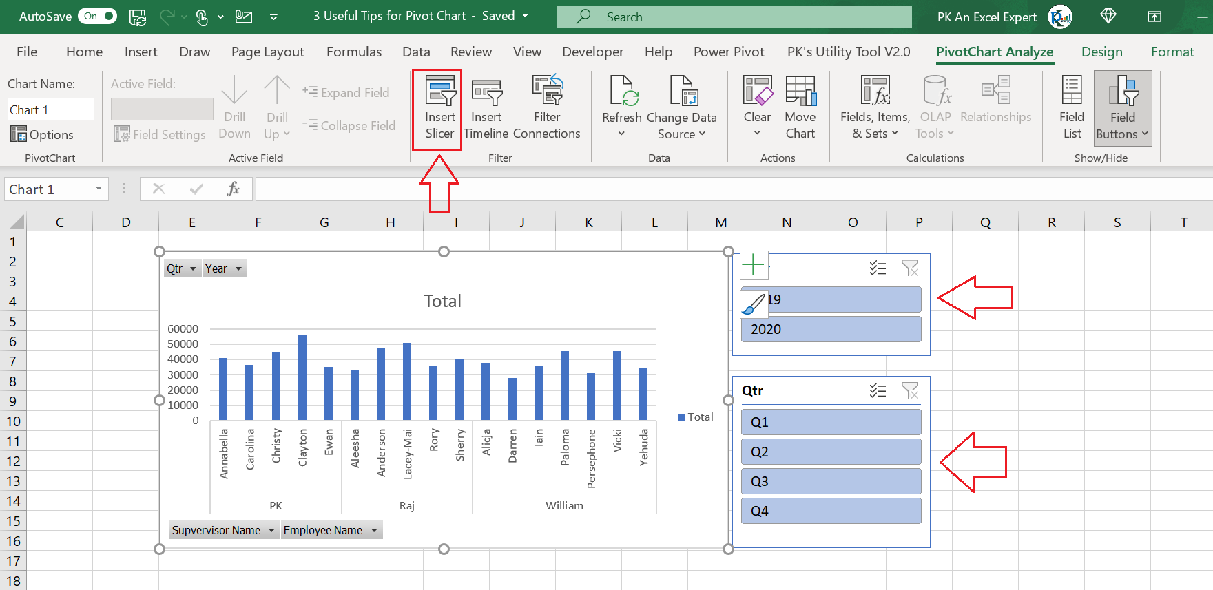
Adding Slicers
Slicers are visual filters for your Pivot Charts. They make data filtering easy and intuitive.
To add a slicer:
Click on your Pivot Chart.
Go to the Analyze tab.
Select Insert Slicer.
Choose the fields to filter.
Click OK.
Slicers appear as buttons, making data filtering simple. You can click on these buttons to filter data instantly. This helps in focusing on specific data points easily.
Using Timelines
Timelines are special slicers for date fields. They allow you to filter data by specific time periods.
To add a timeline:
Click on your Pivot Chart.
Go to the Analyze tab.
Select Insert Timeline.
Choose the date field.
Click OK.
Timelines are displayed as scrollable bars. You can drag the timeline to filter data by months, quarters, or years. This helps in analyzing trends over specific time periods.
Feature | Benefit |
|---|---|
Slicers | Quickly filter data with visual buttons |
Timelines | Filter data by time periods easily |
Both slicers and timelines enhance the interactivity of Pivot Charts. They make data analysis more dynamic and insightful.
Analyzing Data With Pivot Charts
Excel Pivot Charts are powerful tools for data analysis. They help visualize trends, patterns, and insights. By using Pivot Charts, you can make data-driven decisions quickly. Let’s explore some tips and tricks for analyzing data with Pivot Charts.
Filtering Data
Filtering data in Pivot Charts helps focus on specific subsets. You can use filters to narrow down data, making analysis easier. Follow these steps to filter data:
Select your Pivot Chart.
Go to the PivotChart Analyze tab.
Click on Insert Slicer.
Choose the fields you want to filter.
Click OK.
You can also use the Filter option in the PivotTable Fields pane. This allows you to set criteria for filtering data.
Grouping Data
Grouping data in Pivot Charts helps to categorize information. It makes data analysis more organized. To group data, follow these steps:
Select your Pivot Chart.
Right-click on the field you want to group.
Choose Group from the context menu.
Specify the grouping criteria, such as dates or numbers.
Click OK.
Grouping data by date can help analyze trends over time. You can group by months, quarters, or years. This provides a clearer view of data patterns.
Excel Pivot Charts are essential for data analysis. Use filtering and grouping to enhance your data insights. Start exploring these features today and make the most of your data.
Common Pitfalls And Solutions
Working with Excel Pivot Charts can be incredibly powerful, but it comes with its own set of challenges. This section will address common pitfalls and their solutions, helping you make the most of your data.
Avoiding Data Misinterpretation
Data misinterpretation is a frequent issue with Pivot Charts. Ensure that your data is clean and properly formatted. An incorrectly formatted dataset can lead to inaccurate results.
Use clear and concise labels to avoid confusion. Misleading labels can make your chart hard to understand.
Always double-check your data source. Verify that your data is up-to-date and relevant.
Troubleshooting Errors
Errors can pop up when creating or modifying Pivot Charts. Knowing how to troubleshoot them can save you time and effort.
Error | Solution |
|---|---|
Incorrect Data | Check data formatting and source. |
Blank Cells | Fill in or remove blank cells. |
Calculation Errors | Verify formulas and calculations. |
Check for blank cells in your dataset. They can cause errors or misleading results. Fill them in or remove them.
Ensure your formulas are correct. Incorrect formulas can lead to calculation errors. Double-check your calculations.
By addressing these common pitfalls, you can create accurate and effective Pivot Charts.
Best Practices
Mastering Excel Pivot Charts can transform your data visualization skills. Follow these best practices to ensure your charts are effective and easy to understand.
Keeping Charts Simple
Simplicity is key in creating clear and effective Pivot Charts.
Limit the number of data points: Too many points can overwhelm viewers.
Use appropriate chart types: Choose a chart type that best represents your data.
Avoid clutter: Remove unnecessary gridlines, labels, and colors.
Highlight key data: Use colors and labels to emphasize important information.
Regularly Updating Data
Keeping your data up-to-date ensures your Pivot Charts remain accurate and relevant.
Refresh data frequently: Regularly update your data source to reflect the latest information.
Automate updates: Use Excel’s features to automate data refreshing.
Check for errors: Validate data to prevent inaccuracies in your charts.
Backup data: Always keep a backup to avoid data loss.
Following these best practices will enhance your Excel Pivot Chart skills and improve your data presentations.
Real-world Applications
Excel Pivot Charts are powerful tools. They help transform data into insightful visuals. These charts find real-world applications in various fields. Here are some examples:
Business Reporting
Businesses rely on data for decision-making. Pivot Charts simplify this process. Here are some key applications:
Sales Analysis: Track sales trends over time. Identify top-selling products.
Financial Reports: Visualize expenses and revenues. Compare budget versus actuals.
Customer Insights: Understand customer demographics. Spot patterns in purchasing behavior.
Using Pivot Charts in business reporting offers several benefits. It makes data easy to understand. It also helps in quick decision-making.
Academic Research
Researchers often deal with large datasets. Pivot Charts provide a way to visualize complex data. Here are some applications in academia:
Survey Analysis: Summarize survey results. Visualize respondent demographics and answers.
Statistical Data: Create charts for statistical data. Make complex numbers easy to understand.
Experimental Data: Track results from experiments. Compare different variables visually.
Pivot Charts make academic research more accessible. They turn raw data into comprehensible visuals. This aids in presenting findings effectively.
Frequently Asked Questions
How Do I Create A Pivot Chart In Excel?
To create a Pivot Chart, select your data, then go to the “Insert” tab. Click on “PivotChart”. Choose your desired chart type and customize as needed.
Can I Update A Pivot Chart Automatically?
Yes, you can. Right-click the Pivot Chart and select “PivotTable Options”. Enable “Refresh data when opening the file”. This keeps your chart updated.
What Types Of Charts Can Pivot Charts Use?
Pivot Charts can use various types including bar, line, and pie charts. Choose the best chart type for your data analysis needs.
How Do I Filter Data In A Pivot Chart?
To filter data, click on the drop-down arrows next to the field names in the PivotTable Field List. Select or deselect the items you want.
Conclusion
Mastering Excel Pivot Charts can transform your data analysis. Implement these tips for clearer insights and better decisions. Practice regularly to become proficient. Keep exploring new features and stay updated. Your enhanced skills will make data visualization more effective and impactful.
Happy charting!