To create an Excel Gantt Chart, start by listing your project tasks and dates. Then, use a stacked bar chart to visualize them.
Gantt Charts are essential tools for project management. They help visualize project timelines, making it easier to track progress and manage deadlines. Excel, a widely-used spreadsheet program, offers a straightforward way to create these charts. By organizing tasks and timelines efficiently, you can ensure your project stays on track.
Excel’s built-in features simplify the process, allowing you to focus on project management rather than complex chart creation. This guide will walk you through each step, ensuring you can create a clear, effective Gantt Chart in Excel.
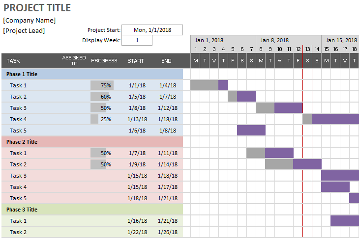
Credit: www.vertex42.com
Introduction To Gantt Charts
A Gantt chart is a powerful tool for project management. It helps visualize project timelines and tasks. This blog post will guide you step by step to create an Excel Gantt Chart.
History And Importance
Gantt charts were invented by Henry L. Gantt in the 1910s. They are essential in project management for tracking progress. These charts show start and end dates for tasks. They also highlight task dependencies and milestones.
| Year | Milestone |
|---|---|
| 1910 | Henry Gantt invents Gantt charts |
| 1980s | Adoption in project management software |
| 2000s | Integration with various digital tools |
Benefits For Project Management
Gantt charts offer several benefits in project management:
- Visual Clarity: They provide a clear visual of project tasks.
- Time Management: Helps in tracking timelines and deadlines.
- Resource Allocation: Ensures optimal use of resources.
- Task Dependencies: Shows relationships between tasks.
- Progress Tracking: Monitors project progress in real-time.
These advantages make Gantt charts indispensable tools for project managers. They simplify complex projects and improve efficiency.
Setting Up Your Excel Sheet
Creating a Gantt chart in Excel is a powerful way to visualize project timelines. The first step is setting up your Excel sheet. This involves choosing the right template and customizing columns and rows. Follow this simple guide for a smooth start.
Choosing The Right Template
Excel offers many templates. Open Excel and search for “Gantt Chart”. Select a template that suits your project needs. Templates save time and provide a structured format.
Customizing Columns And Rows
Now, tailor the template to fit your project.
- Adjust the column widths for better readability.
- Rename columns to match project tasks.
- Use the header row for task names, start dates, and end dates.
Ensure each task has its own row. This helps in tracking progress. Use colors to differentiate tasks. This makes the chart visually appealing. Here is a simple table structure:
| Task | Start Date | End Date | Duration |
|---|---|---|---|
| Task 1 | 01/01/2023 | 01/05/2023 | 4 days |
| Task 2 | 01/06/2023 | 01/10/2023 | 4 days |
Adjust the table as needed. Ensure all dates are accurate. This is crucial for project tracking.
Defining Project Tasks
Defining project tasks is crucial for creating an effective Excel Gantt chart. This step sets the foundation for the entire project timeline. You need to identify and document all the tasks that your project entails. Without a clear task list, tracking project progress becomes difficult.
Listing All Tasks
Start by making a comprehensive list of all project tasks. This will be the backbone of your Gantt chart. Use a simple table in Excel for this purpose.
| Task ID | Task Name |
|---|---|
| 1 | Define Project Scope |
| 2 | Identify Stakeholders |
| 3 | Develop Project Plan |
Make sure to include all tasks, no matter how small. Missing a task can disrupt your entire project timeline.
Assigning Start And End Dates
After listing all tasks, assign start and end dates to each. This helps in tracking the duration of each task. Use another column in your Excel sheet for this purpose.
| Task ID | Task Name | Start Date | End Date |
|---|---|---|---|
| 1 | Define Project Scope | 01/01/2023 | 01/05/2023 |
| 2 | Identify Stakeholders | 01/06/2023 | 01/10/2023 |
| 3 | Develop Project Plan | 01/11/2023 | 01/20/2023 |
Ensure that the dates are realistic and achievable. Accurate dates make the Gantt chart more effective.
Use these steps to define your project tasks clearly. This will help in creating a detailed and accurate Excel Gantt chart.
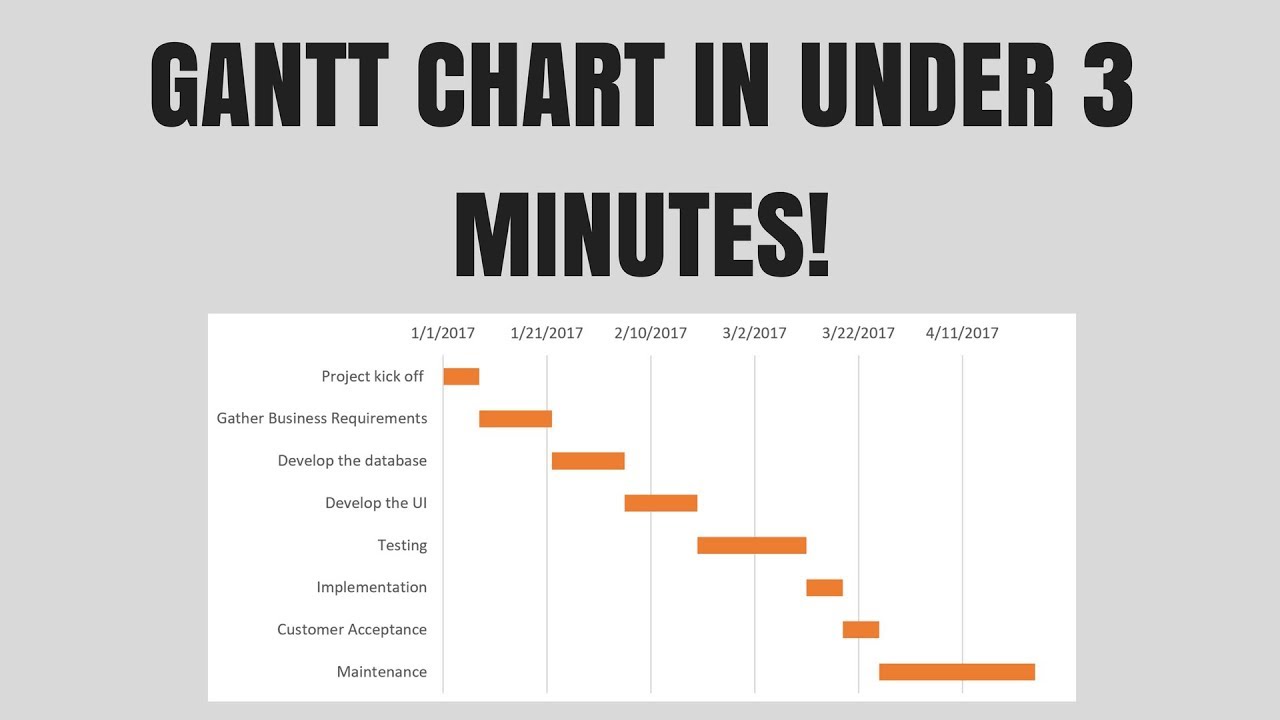
Credit: www.youtube.com
Creating The Gantt Chart
Creating a Gantt Chart in Excel can help manage projects efficiently. This section will guide you through the process step by step.
Using Excel’s Bar Chart Feature
To create a Gantt Chart, start with a simple bar chart.
- Open Excel and input your project data.
- Organize the data with columns for tasks, start dates, and durations.
- Select the data range, including headers.
- Navigate to the Insert tab.
- Click on the Bar Chart icon.
- Choose the Stacked Bar Chart option.
Your chart will now display a basic bar chart.
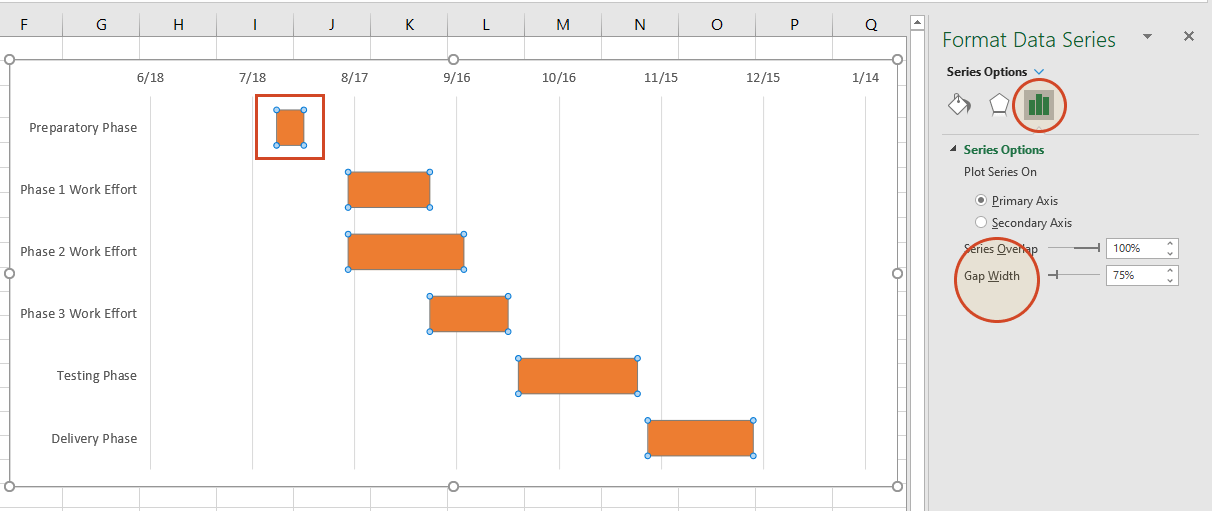
Formatting The Chart
Next, format your chart to resemble a Gantt Chart.
- Click on the chart to select it.
- Right-click on the bars and select Format Data Series.
- In the Format Data Series pane, choose Fill & Line.
- Select No Fill for the start date series.
- Change the color of the duration bars to your preference.
Now, your chart should start looking like a Gantt Chart.
Adjust the Axis Options to improve readability.
- Right-click on the horizontal axis.
- Select Format Axis.
- In the Format Axis pane, set the Minimum value to your project start date.
- Adjust the Maximum value to fit your project timeline.
Your Gantt Chart is now complete and ready for use.
Adding Dependencies
In an Excel Gantt chart, adding dependencies helps track task relationships. Dependencies ensure tasks follow a logical order, preventing delays and bottlenecks. Learn how to link tasks and set milestones in your Gantt chart.
Linking Tasks
Linking tasks establishes a sequence. This ensures one task starts after another finishes. To link tasks in Excel:
- Identify the tasks you want to link.
- In a new column, label it “Predecessor”.
- Enter the predecessor task’s number for each task.
This creates a clear visual of task order. Use arrows to show dependencies. Highlight the connected tasks for clarity. Excel’s cell references help manage these links easily.
Setting Milestones
Milestones mark significant points in your project. They are key targets or deadlines. To add milestones:
- Create a new row for the milestone.
- Enter the milestone name in the task column.
- Set the start and end dates to be the same.
Format the milestone differently. Use bold text or a distinct color. This makes it stand out. Milestones help track progress and stay on schedule.
| Task | Start Date | End Date | Predecessor |
|---|---|---|---|
| Task 1 | 2023-10-01 | 2023-10-05 | |
| Task 2 | 2023-10-06 | 2023-10-10 | 1 |
| Milestone 1 | 2023-10-11 | 2023-10-11 |
Dependencies and milestones keep your Gantt chart organized. They provide a clear path to project completion.
Customizing Your Gantt Chart
Creating a Gantt chart in Excel is just the beginning. Customizing it makes your project plan stand out. This section guides you through the most effective ways to personalize your Gantt chart.
Color Coding Tasks
Color coding tasks helps to differentiate various activities. It makes the chart visually appealing and easy to understand.
- Select the task bar you wish to color.
- Right-click and choose Format Data Series.
- Go to the Fill option and choose your desired color.
- Repeat for other tasks to create a colorful, organized chart.
Use different colors for distinct phases or priority levels.
Adding Labels And Legends
Labels and legends provide context to your Gantt chart. They help viewers understand what each bar represents.
- Select the chart and click on the Chart Elements button.
- Check the box for Data Labels to add labels to your bars.
- To add a legend, check the Legend box.
- Click on the legend to move it to your preferred location.
Clearly labeled tasks and an easy-to-read legend improve chart readability.
| Feature | Steps |
|---|---|
| Color Coding Tasks |
|
| Adding Labels and Legends |
|
These customization steps enhance your Excel Gantt chart’s clarity and effectiveness.
Updating And Maintaining
Keeping your Excel Gantt Chart updated is crucial for project success. Regular updates ensure your project stays on track. You can easily manage tasks, dates, and dependencies. Let’s explore the key areas of updating and maintaining your Gantt Chart.
Tracking Progress
Tracking progress helps you see how your project is advancing. You can mark tasks as complete or in progress. Use colors or symbols to show task status.
- Green: Task completed
- Yellow: Task in progress
- Red: Task not started
Update the status regularly. This makes your Gantt Chart accurate and useful.
Adjusting Dates And Dependencies
Projects often change. Adjusting dates and dependencies is necessary. If a task is delayed, update the start and end dates. This keeps the timeline accurate.
| Task | Start Date | End Date | Dependencies |
|---|---|---|---|
| Task 1 | 2023-01-01 | 2023-01-05 | None |
| Task 2 | 2023-01-06 | 2023-01-10 | Task 1 |
Dependencies show how tasks relate. If Task 1 is delayed, Task 2 must adjust. Keeping these updated ensures all team members are on the same page.
Credit: www.officetimeline.com
Exporting And Sharing
Once you have created your Excel Gantt Chart, it’s essential to know how to share it. Exporting and sharing your chart makes collaboration easier. Here’s a step-by-step guide to help you.
Saving As Pdf
Saving your Excel Gantt Chart as a PDF is straightforward. Follow these steps:
- Click on the File tab in Excel.
- Select Save As from the menu.
- Choose the location where you want to save the file.
- In the Save as type dropdown, select PDF.
- Click Save.
By saving as a PDF, you ensure your chart’s format remains unchanged. This makes it easy to share with others.
Sharing With Team Members
Once your chart is saved, you can share it with your team. Here are a few methods:
- Email: Attach the PDF to an email. Send it to your team members.
- Cloud Storage: Upload the PDF to cloud services like Google Drive or Dropbox. Share the link with your team.
- In-App Sharing: If using Microsoft 365, you can share directly from Excel. Click on Share in the top-right corner.
Sharing your Gantt Chart helps keep everyone on the same page. It ensures effective communication within your team.
Frequently Asked Questions
What Is A Gantt Chart In Excel?
A Gantt chart in Excel is a visual project management tool. It helps track tasks, timelines, and deadlines. It displays project progress.
How Do I Create A Gantt Chart In Excel?
To create a Gantt chart, use Excel’s stacked bar chart feature. Customize it to display tasks and timelines. Add task names and dates.
Can I Use Excel For Project Management?
Yes, Excel is useful for project management. You can create Gantt charts, track tasks, and manage timelines. It’s flexible and customizable.
What Are The Benefits Of Using Excel Gantt Charts?
Excel Gantt charts offer visual project tracking. They are easy to create and update. They help in managing deadlines and task dependencies.
Conclusion
Creating an Excel Gantt chart can enhance project management. Follow the steps outlined for accurate timelines and efficiency. Practice regularly to master this skill. An Excel Gantt chart streamlines complex projects, making planning easier. Start today and watch your productivity soar with visual project tracking.