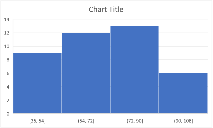
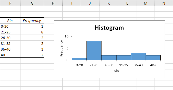
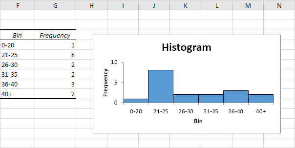
A histogram in Excel visualizes data distribution by displaying the frequency of data points within specific intervals. It helps identify patterns and trends in datasets.
Histograms are essential tools for data analysis. They allow users to see the distribution of their data clearly and quickly. Creating a histogram in Excel is straightforward and involves using the built-in histogram chart option. Users can customize the intervals, also known as bins, to fit their data’s unique characteristics.
This customization helps in better understanding the data’s spread and concentration. Histograms are particularly useful in identifying outliers and understanding the central tendency of the data. They are widely used in various fields, including business, science, and engineering, for effective data interpretation.
Introduction To Excel Histograms
Excel Histograms are powerful tools for data analysis. They help visualize the distribution of data. Creating histograms in Excel is straightforward and very useful.
What Is A Histogram?
A histogram is a type of bar chart. It shows the frequency of data points within specified ranges, or bins. Each bar represents a bin, and its height shows the number of data points in that bin.
Importance In Data Visualization
Histograms make it easy to see the distribution of your data. This can highlight patterns, trends, and outliers.
- Identify patterns: See how data is distributed.
- Spot trends: Find common ranges in your data.
- Detect outliers: Identify values that stand out.
Histograms are essential for data analysis. They provide a clear visual representation of data distribution.
How To Create A Histogram In Excel
- Open Excel and load your data.
- Select the data range.
- Go to the “Insert” tab.
- Click on “Insert Statistic Chart”.
- Select “Histogram”.
Follow these steps to create a histogram. It will help you analyze your data effectively.
Excel Histograms are easy to create. They provide valuable insights into your data. Use them to make informed decisions based on your data analysis.
Preparing Your Data
Creating an Excel Chart Histogram can provide valuable insights from your data. The first step is preparing your data. Proper data preparation ensures your histogram is accurate and informative.
Cleaning The Data
Before creating a histogram, clean your data. Remove any duplicates and irrelevant entries. This ensures your data set is accurate.
- Remove empty cells.
- Check for and correct spelling errors.
- Eliminate outliers if they skew your results.
Use Excel’s built-in tools for cleaning data. This includes the Remove Duplicates feature and the Data Validation tool.
Organizing Data For Analysis
After cleaning, organize your data. This makes it easier to analyze.
- Sort your data. This helps in identifying patterns.
- Group similar data points. Use categories or bins.
- Label your data. Clear labels improve readability.
For a histogram, your data should be in a single column. Each cell should contain a numerical value.
| Data Point |
|---|
| 5 |
| 10 |
| 15 |
By following these steps, you ensure your data is ready for creating an effective histogram.
Creating A Histogram In Excel
Creating a histogram in Excel is simple and fun. A histogram helps visualize data distribution. It shows frequency of data points in specified ranges. You can create a histogram using two main methods: Using the Analysis Toolpak and the Manual Method.
Using The Analysis Toolpak
The Analysis Toolpak is an Excel add-in. It provides data analysis tools. Follow these steps to create a histogram using the Analysis Toolpak:
- First, enable the Analysis Toolpak. Go to File > Options > Add-ins.
- In the Add-ins box, select Excel Add-ins and click Go.
- Check the Analysis Toolpak box and click OK.
- Now, go to the Data tab on the Ribbon.
- Click on Data Analysis in the Analysis group.
- Select Histogram from the list and click OK.
- Select the input range for your data and the bin range.
- Choose an output range or a new worksheet.
- Check the Chart Output box and click OK.
Your histogram will now appear on your worksheet. You can customize it further using chart tools.
Manual Method
You can also create a histogram manually. Follow these steps to do it:
- First, organize your data in a column.
- Next, create a bin range in another column. This range will define the intervals.
- Use the COUNTIFS function to count data points within each bin.
Here is an example:
=COUNTIFS(A2:A20, ">=" & B2, A2:A20, "<" & B3)In this formula:
- A2:A20 is the data range.
- B2 is the lower limit of the bin.
- B3 is the upper limit of the bin.
Repeat this for all bins. Then, create a column chart:
- Select the bin range and frequency range.
- Go to the Insert tab on the Ribbon.
- Click on Insert Column or Bar Chart.
- Select the desired chart type.
Now, you have created a histogram manually. You can format it as needed.
Customizing Your Histogram
Customizing your histogram in Excel can enhance data visualization. It allows you to tailor the chart to your needs. Let’s explore how to adjust bin ranges and change chart styles.
Adjusting Bin Ranges
Bin ranges determine how your data is grouped. Customizing bin ranges helps highlight specific trends. To adjust them, follow these steps:
- Click on your histogram chart.
- Select the Format Axis option.
- In the Axis Options pane, find the Bin Width or Number of Bins section.
- Enter your desired values for bin width or number of bins.
Here’s a quick example of how you might set your bin ranges:
| Bin Width | 5 |
|---|---|
| Number of Bins | 10 |
Changing Chart Styles
Changing chart styles can make your histogram more appealing. Excel offers several styles to choose from:
- Classic
- Modern
- Dark
- Colorful
To change the style, follow these steps:
- Click on your histogram chart.
- Go to the Chart Tools section.
- Select the Design tab.
- Choose a style from the Chart Styles gallery.
Experiment with different styles to see what works best for your data.
Interpreting Histogram Data
Understanding histogram data is crucial for data analysis. A histogram helps visualize data distribution. This section will guide you on interpreting histogram data effectively.
Identifying Patterns
Histograms help in recognizing data patterns. Check the shape of the histogram:
- Bell-shaped: Indicates a normal distribution.
- Skewed Left: Most data points are on the right.
- Skewed Right: Most data points are on the left.
- Uniform: Data points are evenly spread.
Identifying these patterns helps in understanding data behavior. For example, a bell-shaped histogram suggests data is symmetrically distributed.
Spotting Outliers
Outliers are data points that differ significantly from other observations. They can distort the overall data analysis. Histograms are useful for spotting these outliers.
To identify outliers:
- Look for bars that are isolated from others.
- Check for extremely high or low values.
Outliers can indicate errors or special cases in your data. Investigate these points to understand their impact.
| Pattern | Description |
|---|---|
| Bell-shaped | Normal distribution |
| Skewed Left | Most data on the right |
| Skewed Right | Most data on the left |
| Uniform | Evenly spread data |
Understanding these patterns and outliers enhances your data interpretation. It helps in making informed decisions based on the data.

Credit: trumpexcel.com
Advanced Histogram Techniques
Excel histograms are great for data analysis. But, advanced histogram techniques can take your data visualization to the next level. Here, we will explore two key techniques: overlaying a normal distribution and combining histograms.
Overlaying Normal Distribution
Overlaying a normal distribution curve helps you compare your data to a standard curve. Here’s how you can do it:
- First, create a histogram of your data.
- Then, calculate the mean and standard deviation of the data.
- Next, generate the normal distribution values using the
NORM.DISTfunction. - Finally, overlay the normal distribution curve on your histogram.
Here’s an example table with calculated values:
| Data | Normal Distribution |
|---|---|
| 5 | 0.05 |
| 10 | 0.1 |
| 15 | 0.15 |
Overlaying this curve makes it easy to see data patterns. This helps in making data-driven decisions.
Combining Histograms
Combining histograms is useful for comparing multiple data sets. Follow these steps to combine histograms:
- Create a histogram for each data set.
- Ensure each histogram uses the same bins.
- Overlay the histograms on the same chart.
Combining histograms helps you spot differences between data sets. It also highlights any similarities.
For example, if you have sales data for two products, combined histograms show their performance over time.
Here is a quick example:
| Bins | Product A | Product B |
|---|---|---|
| 0-10 | 5 | 7 |
| 10-20 | 15 | 12 |
| 20-30 | 25 | 22 |
Combining histograms makes it easy to compare different data sets visually. This technique is effective for presentations and reports.
Common Issues And Fixes
Creating a histogram in Excel can sometimes be tricky. Users often face common issues that can be easily fixed with the right steps. Let’s explore two frequent problems: handling empty bins and dealing with skewed data.
Handling Empty Bins
An empty bin in a histogram can confuse users. It may suggest missing data or poor data distribution. Here’s how to address it:
- Check Data Range: Ensure the data range covers all relevant values.
- Adjust Bin Width: Smaller bins may capture more data points.
- Remove Outliers: Outliers can create empty bins. Remove or adjust them.
Adjusting these factors will often solve empty bin issues. Always double-check your data range first.
Dealing With Skewed Data
Skewed data can mislead histogram interpretations. Skewness occurs when data points cluster on one side. To fix this:
- Normalize Data: Use log transformation or other normalization methods.
- Adjust Bin Sizes: Larger bins can help balance skewed data.
- Use Different Chart Types: Sometimes, a box plot or line chart works better.
These steps help to create a more accurate histogram. Always choose the method that best fits your data set.

Credit: www.excel-easy.com
Practical Applications
Excel Chart Histograms are versatile tools with various practical uses. These charts help in visualizing data distribution. Here, we explore their applications in different fields.
Business Analytics
In business, Excel Chart Histograms can analyze sales performance. They help in identifying sales trends and customer preferences. Consider the following key applications:
- Sales Distribution: Analyze the frequency of sales in different ranges.
- Customer Segmentation: Group customers based on purchase behavior.
- Inventory Management: Track stock levels and turnover rates.
- Performance Metrics: Measure employee performance across different metrics.
For example, a sales manager can use a histogram to see how many products sold within certain price ranges. This helps in pricing strategy adjustments.
Scientific Research
In scientific research, Excel Chart Histograms are crucial for data analysis. They help in understanding data distributions and identifying patterns. Key applications include:
- Data Distribution: Visualize the spread of experimental data.
- Frequency Analysis: Identify how often values occur within a dataset.
- Comparative Studies: Compare distributions between different groups or conditions.
- Error Analysis: Detect outliers and assess measurement accuracy.
For instance, a biologist might use a histogram to analyze the frequency of a specific gene expression within a population. This aids in understanding the gene’s impact on the population.
In both fields, Excel Chart Histograms provide valuable insights, aiding in decision-making and strategic planning.
Tips And Best Practices
Creating an effective histogram in Excel can be easy with the right tips. Here we share best practices to make your data visually appealing and accurate.
Choosing The Right Bin Size
Choosing the right bin size is crucial for your histogram. It affects how your data is displayed.
- Too few bins: Your data looks oversimplified.
- Too many bins: Your data appears cluttered and confusing.
To find the optimal bin size, consider these steps:
- Count the total number of data points.
- Use the Square Root Choice: Calculate the square root of the total data points.
- Apply the Sturges’ Formula: Use \( k = 1 + \log_2(N) \) where \( k \) is the number of bins and \( N \) is the number of data points.
These methods help achieve a balance between too few and too many bins.
Maintaining Data Integrity
Maintaining data integrity ensures your histogram is accurate and reliable.
Follow these best practices to keep data integrity:
- Check for duplicates: Remove any duplicate entries in your data set.
- Handle missing values: Replace or remove missing values to avoid skewed results.
- Consistent data format: Ensure all data points follow the same format.
These steps help in creating a clear and trustworthy histogram.

Credit: www.excel-easy.com
Frequently Asked Questions
What Is A Histogram In Excel?
A histogram in Excel is a graphical representation of data distribution. It shows the frequency of data points within specified ranges.
How To Create A Histogram In Excel?
To create a histogram, select your data, go to the ‘Insert’ tab, and choose ‘Histogram’ from the chart options.
Can I Customize My Excel Histogram?
Yes, you can customize your histogram. You can change bin ranges, colors, and labels to better fit your data.
Why Use A Histogram In Excel?
Histograms help visualize the distribution of data. They make it easier to understand patterns, trends, and outliers.
Conclusion
Creating a histogram in Excel simplifies data analysis and visualization. It helps you identify trends and patterns quickly. With these steps, anyone can make informative histograms. Enhance your data presentation skills today. Start using Excel’s powerful charting features to make data-driven decisions.
Happy charting!


