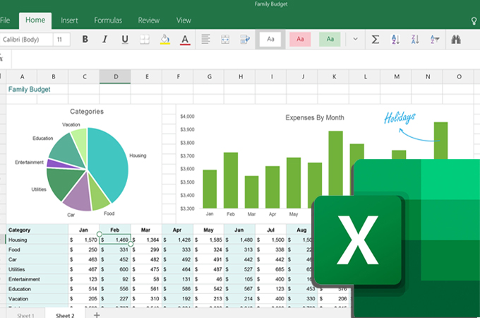
To create a chart in Excel, select your data range and click on the ‘Insert’ tab. Choose the chart type you want.
Creating charts in Excel is a straightforward process that enhances data visualization. Charts help in understanding data trends and patterns at a glance. Excel offers various chart types like bar, line, pie, and scatter plots. These charts can be customized to fit specific needs and preferences.
With Excel’s intuitive interface, even beginners can create professional-looking charts quickly. The step-by-step approach ensures accuracy and clarity, making data presentation more effective. Mastering chart creation in Excel can significantly improve your data analysis skills. This guide will help you create charts efficiently, making your data more impactful and easier to interpret.
Introduction To Excel Charts
Excel charts are visual tools that help you understand data quickly. They turn numbers into easy-to-read graphics. You can see patterns, trends, and outliers. This makes your data analysis more effective and engaging.
Importance Of Charts
Charts are important for many reasons. They make data more accessible. You can grasp complex information at a glance. Charts highlight key points in your data. They are perfect for presentations and reports. They make your work look professional and polished.
Types Of Charts
Excel offers various types of charts. Each chart type serves a different purpose. Here are some common types:
- Column Chart: Compares values across categories.
- Line Chart: Shows trends over time.
- Pie Chart: Displays parts of a whole.
- Bar Chart: Similar to column charts but horizontal.
- Scatter Plot: Shows relationships between two variables.
| Chart Type | Usage |
|---|---|
| Column Chart | Comparing values across categories |
| Line Chart | Showing trends over time |
| Pie Chart | Displaying parts of a whole |
| Bar Chart | Comparing values horizontally |
| Scatter Plot | Showing relationships between variables |
Choosing the right chart type is crucial. It affects how well your data is understood. Always think about what you want to show before picking a chart type.
Preparing Your Data
Creating a chart in Excel begins with preparing your data. Your data should be clear and well-organized. This ensures accurate and easy-to-read charts.
Organizing Data
Start by arranging your data in a logical format. Use rows for individual records and columns for different variables. Each column should have a header that describes the data it contains.
Here’s a simple example:
| Month | Sales |
|---|---|
| January | 1000 |
| February | 1500 |
| March | 2000 |
Make sure there are no blank rows or columns in your data. This keeps your chart accurate and clean.
Selecting Data Range
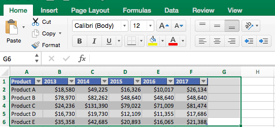
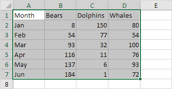
To create a chart, you need to select the data range. Click and drag to highlight the cells you want to include in your chart. Ensure you include headers, as they help Excel label the chart correctly.
For example, to select the data from our table:
- Click on the first cell (A1).
- Drag to the last cell (B4).
This will highlight all the data you need for your chart. Once your data is selected, you are ready to create your chart.
Inserting A Chart
Creating a chart in Excel can simplify data visualization. Follow these easy steps to insert a chart and make your data shine.
Choosing Chart Type
First, you need to choose the right chart type. Excel offers various chart options like bar, line, pie, and more.
- Highlight your data range.
- Navigate to the Insert tab on the ribbon.
- Click on the Charts group.
- Select your desired chart type (e.g., Column Chart).
Choosing the correct chart type is essential. It determines how well your data is presented.
Using Chart Wizard
The Chart Wizard is a helpful tool. It guides you through the chart creation process.
- Select your data range.
- Go to the Insert tab.
- Click on the Recommended Charts button.
- Choose a chart from the Insert Chart dialog box.
- Click OK to insert the chart.
Using the Chart Wizard simplifies the process. It ensures you choose the best chart format for your data.
These steps make inserting a chart in Excel quick and easy. Your data will become clearer and more engaging.

Credit: www.smartsheet.com
Customizing Chart Elements
Creating a chart in Excel is just the beginning. Customizing chart elements can make your data visually appealing and easier to understand. This section will guide you on how to modify titles and adjust axis labels in your Excel charts.
Modifying Titles
To change the chart title in Excel, follow these steps:
- Select the chart by clicking on it.
- Click on the Chart Title text box.
- Type your desired title directly into the text box.
- Press Enter to apply the new title.
You can also format the title text:
- Right-click on the Chart Title text box.
- Select Format Chart Title from the menu.
- Use the options to change the font, size, and color.
Adjusting Axis Labels
Axis labels help identify data points on your chart. Here’s how to adjust them:
- Select the chart by clicking on it.
- Right-click on the axis you want to change.
- Choose Format Axis from the context menu.
In the Format Axis pane, you can:
- Change the Axis Title by typing in the text box.
- Adjust the Number format to display data as needed.
- Set the Minimum and Maximum values to scale your axis appropriately.
Additionally, you can rotate the axis labels for better readability:
- In the Format Axis pane, go to the Text Options.
- Click on the Text Box icon.
- Set the Custom Angle to rotate the labels.
By customizing these elements, you can make your Excel charts both informative and attractive.
Formatting The Chart
Once you have created a chart in Excel, the next step is to format it. Formatting your chart can make your data more visually appealing and easier to understand. Let’s dive into the steps to change colors and apply styles to your chart.
Changing Colors
Changing the colors in your chart can highlight important data points. Follow these steps to change the colors:
- Click on your chart to select it.
- Go to the Chart Tools on the Ribbon.
- Click on the Format tab.
- Select Shape Fill or Shape Outline to change the colors.
You can use different colors for different data series. This helps in distinguishing various parts of your data easily.
Applying Styles
Excel offers various styles to make your chart more professional. Here’s how you can apply styles:
- Select your chart by clicking on it.
- Navigate to the Chart Tools section on the Ribbon.
- Click on the Design tab.
- Choose a style from the Chart Styles gallery.
Applying styles can change the overall look of your chart. It can make your data more readable and visually appealing.
Here is a quick reference table for the steps mentioned above:
| Action | Steps |
|---|---|
| Change Colors |
|
| Apply Styles |
|
Adding Data Labels
Data labels in Excel charts provide precise information. They show the exact values of data points. This feature makes your charts more understandable and informative. Adding data labels is a simple process. Follow these steps to make your charts clear and professional.
Positioning Labels
Positioning data labels correctly is crucial. The default position may not always work. You can move the labels to different places.
- Select the chart where you want to add labels.
- Click on any data point. All points in that series will highlight.
- Right-click and choose Add Data Labels.
- To move the labels, select the labels again.
- Drag and drop them to your desired position.
This way, you can ensure that labels do not overlap. Proper positioning makes the chart easy to read.
Formatting Labels
Formatting data labels enhances their appearance. You can change font, size, and color to match your chart.
- Click on the chart to select it.
- Right-click on the data labels.
- Choose Format Data Labels from the menu.
- A panel will appear on the right side of the screen.
- In this panel, you can change the font, size, and color of the labels.
- Additionally, you can add borders and backgrounds for better visibility.
Formatted labels make your chart look professional. They also help in highlighting important data points.
| Step | Action |
|---|---|
| 1 | Select the chart. |
| 2 | Right-click and choose Add Data Labels. |
| 3 | Format labels using the panel. |
| 4 | Position the labels correctly. |
Following these steps will make your Excel charts more informative and visually appealing.
Enhancing Chart Appearance
Creating a chart in Excel is straightforward. Improving its appearance makes it stand out. Let’s explore how to enhance your chart’s look.
Using Gridlines
Gridlines help viewers understand data better. To add gridlines:
- Click on the chart.
- Go to the Chart Tools menu.
- Select Layout.
- Click Gridlines.
- Choose the gridlines you want to add.
Gridlines make data points more visible. They help to read the chart quickly. You can choose vertical or horizontal gridlines.
Incorporating Legends
Legends explain what each color or symbol means. To add legends:
- Click on the chart.
- Go to the Chart Tools menu.
- Select Layout.
- Click Legend.
- Choose the legend position.
Legends make charts easy to read. They show what each color represents. You can place legends at the top, bottom, left, or right.
Here’s a summary of the steps:
| Task | Steps |
|---|---|
| Adding Gridlines |
|
| Incorporating Legends |
|
Enhance your chart’s appearance with gridlines and legends. This makes your data clear and easy to understand.

Credit: gitmind.com
Finalizing And Saving
Creating a chart in Excel is a valuable skill. Finalizing and saving your chart ensures it’s ready for presentations or reports. This section will guide you through previewing your chart, and exporting it efficiently.
Previewing Chart
Before saving, you need to preview your chart. This step helps you spot any errors. Follow these steps:
- Select your chart in Excel.
- Click the Preview button in the toolbar.
- Review the chart for accuracy and design.
Make sure all labels and data points are correct. Adjust any colors or fonts if needed. A clear chart makes information easy to understand.
Exporting Chart
Once your chart looks perfect, it’s time to export. Follow these steps:
- Click on the chart to select it.
- Go to the File menu and choose Save As.
- Select the format you need (e.g., PNG, JPEG, PDF).
- Choose the location to save your file.
- Click Save.
Your chart is now saved and ready for use. You can insert it into documents, emails, or presentations. Make sure to save it in a format that suits your needs.

Credit: www.excel-easy.com
Frequently Asked Questions
How Do I Start Creating A Chart In Excel?
To start, select your data range. Then go to the ‘Insert’ tab. Choose the chart type you want.
Which Excel Chart Is Best For My Data?
The best chart depends on your data. Use bar charts for comparisons and line charts for trends.
Can I Customize My Excel Chart?
Yes, you can. Click on the chart and use the ‘Chart Tools’ to customize elements like colors and labels.
How Do I Add Titles To My Excel Chart?
Select your chart and go to ‘Chart Tools. ‘ Click ‘Add Chart Element’ and choose ‘Chart Title. ‘
Conclusion
Creating a chart in Excel is simple with these steps. Follow the guide for accurate results. Charts improve data visualization and analysis. Practice these steps to become proficient. Excel offers various chart types to suit your needs. Happy charting and enhancing your Excel skills!


