
To get descriptive statistics in Excel, go to the “Data” tab and select “Data Analysis.” Choose “Descriptive Statistics” and follow the prompts.
Descriptive statistics summarize data sets, giving insights into the data’s central tendency, dispersion, and shape. Excel offers a straightforward way to generate these statistics using its built-in Data Analysis Toolpak. This tool helps users quickly calculate metrics such as mean, median, mode, standard deviation, and variance.
Descriptive statistics are essential for understanding data distributions and making informed decisions. Excel’s user-friendly interface makes it accessible even for those with minimal statistical knowledge. This guide will walk you through obtaining descriptive statistics, ensuring you can efficiently analyze your data.
Setting Up Excel
Setting up Excel is essential for analyzing data efficiently. Knowing how to enable features and navigate the interface will make your work easier.
Enabling Data Analysis Toolpak
First, you need to enable the Data Analysis ToolPak in Excel. Follow these steps:
- Click on the File tab.
- Select Options from the menu.
- In the Excel Options dialog box, click on Add-Ins.
- At the bottom, find Manage and select Excel Add-ins.
- Click Go.
- Check the box next to Analysis ToolPak.
- Click OK.
Now, the Data Analysis ToolPak is enabled. You can use it for various statistical functions.
Navigating The Excel Interface
Understanding Excel’s interface helps you find tools quickly. Here are some key components:
- Ribbon: Contains tabs like Home, Insert, and Data.
- Quick Access Toolbar: Shortcuts for frequently used commands.
- Worksheet Area: Where you enter and analyze data.
- Formula Bar: Displays the contents of the active cell.
- Status Bar: Shows information about the current mode and selection.
Familiarize yourself with these components to navigate Excel more efficiently. Mastering these basics will make your statistical analysis more effective.

Credit: www.youtube.com
Importing Data
To get descriptive statistics in Excel, you first need to import your data. Proper data importing ensures accuracy in your statistical analysis. This section covers two methods to import data into Excel: loading data from files and manual data entry.
Loading Data From Files
Loading data from files is efficient and accurate. Follow these steps to load your data:
- Open Excel and click on the File tab.
- Select Open, then choose the file type (e.g., CSV, TXT).
- Navigate to the file location and select your data file.
- Click Import and follow the prompts to complete the process.
Ensure your data is clean before loading. Remove any unnecessary characters or spaces.
Manual Data Entry
Manual data entry is useful for small datasets or quick inputs. Follow these steps for manual data entry:
- Open a new Excel worksheet.
- Click on the first cell where you want to enter data.
- Type your data directly into the cell.
- Press Enter to move to the next cell.
- Continue entering data row by row.
Use the Tab key to move horizontally across columns. Use the Enter key to move vertically down rows. Ensure data consistency by double-checking entries.
Both methods help you get your data ready for analysis. Choose the method that suits your dataset size and type.
Basic Descriptive Statistics
Excel is a powerful tool for data analysis. Descriptive statistics help to summarize data sets. In this section, you will learn how to get basic descriptive statistics in Excel.
Mean
The mean is the average value of a data set. To calculate the mean in Excel:
- Select the cell where you want the mean.
- Type
=AVERAGE(range). - Press Enter.
For example, =AVERAGE(A1:A10) calculates the mean of values in cells A1 to A10.
Median
The median is the middle value of a data set. To find the median in Excel:
- Select the cell for the median value.
- Type
=MEDIAN(range). - Press Enter.
For example, =MEDIAN(A1:A10) gives the median of values in cells A1 to A10.
Mode
The mode is the most frequent value in a data set. To calculate the mode in Excel:
- Select the cell for the mode value.
- Type
=MODE.SNGL(range). - Press Enter.
For example, =MODE.SNGL(A1:A10) finds the mode of values in cells A1 to A10.
Range
The range is the difference between the highest and lowest values. To calculate the range in Excel:
- Select the cell for the range value.
- Type
=MAX(range) - MIN(range). - Press Enter.
For example, =MAX(A1:A10) - MIN(A1:A10) calculates the range of values in cells A1 to A10.
Variance
The variance measures the spread of data points. To calculate the variance in Excel:
- Select the cell for the variance value.
- Type
=VAR.S(range). - Press Enter.
For example, =VAR.S(A1:A10) calculates the variance of values in cells A1 to A10.
Standard Deviation
The standard deviation shows how much data deviates from the mean. To calculate the standard deviation in Excel:
- Select the cell for the standard deviation value.
- Type
=STDEV.S(range). - Press Enter.
For example, =STDEV.S(A1:A10) calculates the standard deviation of values in cells A1 to A10.

Credit: www.journalofaccountancy.com
Advanced Descriptive Statistics
Advanced descriptive statistics provide deeper insights into your data. They help in understanding the shape, spread, and central tendency of the data. Excel makes calculating these advanced metrics simple.
Skewness
Skewness measures the asymmetry of the data distribution. Positive skewness indicates a longer right tail. Negative skewness shows a longer left tail.
To calculate skewness in Excel:
- Select the data range.
- Go to the Formulas tab.
- Click on More Functions.
- Choose Statistical.
- Select SKEW.
- Enter the data range.
- Press Enter.
Kurtosis
Kurtosis measures the ‘tailedness’ of the data distribution. High kurtosis means heavy tails and sharp peaks. Low kurtosis indicates light tails and flat peaks.
To calculate kurtosis in Excel:
- Select the data range.
- Go to the Formulas tab.
- Click on More Functions.
- Choose Statistical.
- Select KURT.
- Enter the data range.
- Press Enter.
Percentiles
Percentiles indicate the value below which a given percentage of data falls. They are useful for data comparison.
To calculate percentiles in Excel:
- Select the data range.
- Go to the Formulas tab.
- Click on More Functions.
- Choose Statistical.
- Select PERCENTILE.EXC.
- Enter the data range and desired percentile.
- Press Enter.
Quartiles
Quartiles split the data into four equal parts. They help in understanding data spread and identifying outliers.
To calculate quartiles in Excel:
- Select the data range.
- Go to the Formulas tab.
- Click on More Functions.
- Choose Statistical.
- Select QUARTILE.EXC.
- Enter the data range and quartile number (1, 2, 3, or 4).
- Press Enter.
Using Excel Functions
Excel is a powerful tool for statistical analysis. Using Excel functions, you can quickly get descriptive statistics. These functions simplify data analysis, saving time and effort.
Statistical Functions
Excel offers many built-in statistical functions. These functions help you calculate key statistics.
- AVERAGE: Calculates the mean of a range of cells.
- MEDIAN: Finds the middle value in a data set.
- MODE: Identifies the most frequent value in a range.
- STDEV: Measures the standard deviation of a range.
- VAR: Calculates the variance of a range of cells.
These functions are easy to use. Simply enter the function in a cell. Then, specify the data range.
Formulas And Shortcuts
Using formulas and shortcuts can enhance your efficiency in Excel. Here are some tips:
- Type
=AVERAGE(A1:A10)to get the mean. - Use
=MEDIAN(B1:B10)for the median value. - Enter
=MODE(C1:C10)to find the mode. - Calculate standard deviation with
=STDEV(D1:D10). - Find variance using
=VAR(E1:E10).
These formulas are straightforward. They provide quick results for your data.
Shortcuts can also speed up your work. For instance, use Alt + = to automatically sum a range of cells. This shortcut saves time and reduces errors.
Consider creating a Quick Access Toolbar for frequently used functions. Add your favorite statistical functions to this toolbar. This makes them easily accessible.
| Function | Shortcut | Description |
|---|---|---|
| SUM | Alt + = | Adds up a range of cells. |
| AVERAGE | Custom | Calculates the mean of a range. |
| MEDIAN | Custom | Finds the middle value. |
Using these functions and shortcuts can make your work easier and faster. Excel provides many tools for effective data analysis. Understanding these tools can enhance your productivity.
Credit: alphabench.com
Generating Descriptive Statistics
Excel makes it easy to generate descriptive statistics. You can use it to summarize your data quickly. This helps you understand the data better. Follow these steps to get descriptive statistics in Excel.
Using Data Analysis Toolpak
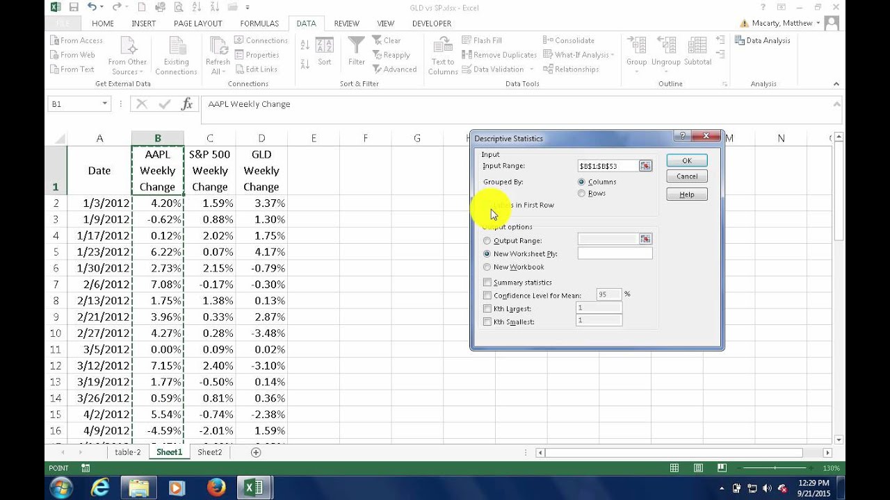
First, ensure the Data Analysis ToolPak is enabled. Go to File > Options > Add-ins. Select Excel Add-ins and click Go. Check Analysis ToolPak and click OK.
To generate statistics, select your data range. Go to Data > Data Analysis. Choose Descriptive Statistics from the list and click OK.
- Select the input range.
- Check the box for Labels in first row if your data has headers.
- Choose the output range.
- Check Summary statistics.
Click OK to view the results. The output will include mean, median, mode, and standard deviation.
Customizing Output
Excel allows you to customize your output. You can choose where to display the results. You can also decide what statistics to include.
In the Output Range box, select a cell. This will be the top-left cell of your results. You can also choose New Worksheet Ply to display results in a new sheet.
Under Descriptive Statistics, you can choose additional options:
- Kurtosis: Measures the peakedness of the data distribution.
- Skewness: Measures the symmetry of the data distribution.
- Range: Difference between the largest and smallest values.
Customize the output to fit your needs. This makes your data analysis more efficient and informative.
Visualizing Data
Understanding data is easier when you visualize it. Excel offers great tools for data visualization. This helps you see trends and patterns quickly. Let’s dive into how to create and interpret visual data in Excel.
Creating Charts And Graphs
Charts and graphs make data easy to understand. Follow these steps to create them:
- Select your data range.
- Go to the Insert tab.
- Choose the type of chart you need, like a bar or line chart.
- Click the chart icon to insert it into your worksheet.
Customize your chart by adding titles, labels, and colors. Use the Chart Tools tab for these options. A well-designed chart makes your data clear and engaging.
Interpreting Visual Data
Once you have your chart, it’s time to interpret it. Look at the peaks and valleys in your data. These show highs and lows.
For example, in a sales chart, a peak might indicate a successful month. A valley could show a month with fewer sales. Use this information to make informed decisions.
Also, pay attention to trends. Is your data going up, down, or staying the same? This tells you if things are improving or not. Patterns in your data are valuable insights.
Visual data helps you understand complex information easily. Excel’s tools make it simple to create and read these visuals. Use charts and graphs to make your data come alive.
Tips And Tricks
Getting descriptive statistics in Excel can be easy with the right tips and tricks. This section covers some of the best practices and common mistakes to avoid.
Best Practices
- Use the Data Analysis Toolpak: Ensure you have enabled the Data Analysis Toolpak. Go to File > Options > Add-Ins > Manage Excel Add-ins > Go. Check the box next to “Analysis ToolPak” and click OK.
- Organize Your Data: Always organize your data in columns with clear headers. This makes it easier to select the correct range for analysis.
- Select the Correct Range: When running the descriptive statistics, double-check the range of cells selected. This ensures accurate results.
- Check for Empty Cells: Empty cells can skew your results. Ensure there are no empty cells in your data range.
- Use Named Ranges: Assign names to your data ranges. This simplifies the process of selecting ranges for analysis.
Common Mistakes To Avoid
- Forgetting to Enable Data Analysis Toolpak: Without this add-in, you can’t access descriptive statistics tools.
- Not Cleaning Data: Ensure your data is clean and free from errors before analysis. This includes removing duplicates and correcting typos.
- Ignoring Outliers: Outliers can distort your results. Identify and handle outliers appropriately.
- Misinterpreting Results: Understand what each statistical measure represents. This helps in making accurate interpretations.
- Overlooking Graphical Representations: Use charts and graphs to visualize your data. This provides a clearer understanding of the statistics.
Example Table For Descriptive Statistics
| Statistic | Description | Example Value |
|---|---|---|
| Mean | Average value of the data set | 50.5 |
| Median | Middle value in the data set | 45.0 |
| Mode | Most frequent value in the data set | 42 |
| Standard Deviation | Measure of data spread | 12.3 |
Frequently Asked Questions
What Are Descriptive Statistics In Excel?
Descriptive statistics summarize data using measures like mean, median, and standard deviation. Excel offers tools to compute these quickly.
How To Find Mean In Excel?
To find the mean, use the AVERAGE function. Select the data range and apply the formula =AVERAGE(range).
How To Calculate Median In Excel?
Use the MEDIAN function in Excel. Select the data range and apply the formula =MEDIAN(range) to find the median.
How To Get Standard Deviation In Excel?
Use the STDEV. P function for standard deviation. Select the data range and apply the formula =STDEV. P(range).
Conclusion
Mastering descriptive statistics in Excel is essential for data analysis. It’s straightforward with the right steps. Utilize Excel’s tools to simplify your work. Remember, practice enhances your skills. Keep exploring Excel’s features to uncover more capabilities. Happy analyzing!