
A pivot table in Excel helps summarize, analyze, and present large data sets efficiently. It offers a dynamic and customizable way to view your data.
Pivot tables are essential for anyone dealing with large amounts of data in Excel. They allow users to quickly extract significant insights without the need for complex formulas. By organizing and summarizing information, pivot tables make data analysis more manageable and comprehensible.
Users can easily drag and drop fields to arrange data in various ways, making it simple to identify trends and patterns. This powerful tool is invaluable for professionals in finance, marketing, and other fields where data-driven decisions are crucial. Mastering pivot tables can greatly enhance your Excel proficiency and streamline your workflow.
Introduction To Pivot Tables
Excel Pivot Tables are powerful tools for data analysis. They help to summarize large data sets quickly. Learn how to use them and make your data work for you. This tutorial will guide you through the basics of Pivot Tables.
What Is A Pivot Table?
A Pivot Table is an interactive table in Excel. It allows users to summarize, analyze, and manipulate large data sets. Pivot Tables can transform detailed data into a concise summary. They help in identifying patterns and trends.
Pivot Tables are dynamic. They can be adjusted by dragging and dropping fields. This feature makes them versatile and user-friendly.
Why Use Pivot Tables?
Pivot Tables offer many benefits:
- Summarize large data sets quickly.
- Identify trends and patterns easily.
- Create dynamic reports.
- Filter and sort data efficiently.
- Perform calculations and aggregations.
Let’s look at a simple example. Imagine you have sales data for a year. You can create a Pivot Table to summarize sales by month, by product, or by salesperson. This helps in understanding which products are performing well and which are not.
| Product | Month | Sales |
|---|---|---|
| Product A | January | $5000 |
| Product B | January | $3000 |
| Product A | February | $7000 |
| Product B | February | $4000 |
Creating a Pivot Table from this data can show you total sales by product or by month. This makes it easy to see which product is selling best.
Credit: www.ablebits.com
Creating Your First Pivot Table
Pivot Tables are powerful tools in Excel. They help you summarize, analyze, and present data. Creating your first Pivot Table might seem daunting. But it’s easier than you think. Let’s break it down step-by-step.
Preparing Your Data
Before creating a Pivot Table, ensure your data is well-organized. Here are some key points:
- Your data should be in a table format.
- Each column should have a header.
- There should be no blank rows or columns.
Here’s an example of well-prepared data:
| Product | Sales | Region |
|---|---|---|
| Apple | 120 | North |
| Orange | 100 | South |
Inserting A Pivot Table
Now that your data is ready, it’s time to insert a Pivot Table. Follow these steps:
- Select any cell in your data range.
- Go to the Insert tab on the Ribbon.
- Click on the PivotTable button.
- A dialog box will appear.
- Ensure the data range is correct.
- Choose where to place the Pivot Table.
- Click OK.
Your Pivot Table is now created. You will see a new sheet with an empty Pivot Table.
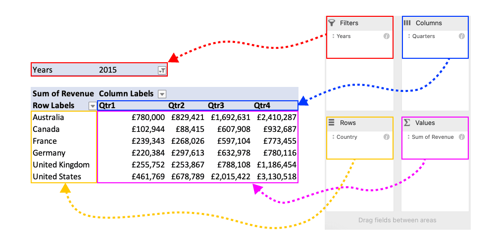
On the right, you’ll see the PivotTable Fields pane. Here, you can drag fields to different areas:
- Filters: To filter data.
- Columns: To display data in columns.
- Rows: To display data in rows.
- Values: To perform calculations.
Experiment with dragging fields to see how your data changes. This way, you can learn how Pivot Tables work.
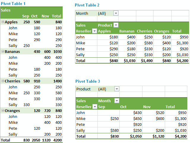
Customizing Pivot Table Layout
Customizing your Pivot Table layout is crucial for data analysis. You can choose rows, columns, and add filters to view data differently. This tutorial will help you understand how to tailor the layout.
Choosing Rows And Columns
To start, select the fields you want to include. Drag them to the Rows or Columns area. This action will arrange the data accordingly.
For instance, if you have sales data, you might drag “Product” to Rows and “Month” to Columns. This layout will show sales of each product by month.
Using this method, your data becomes structured and easy to read. Here’s an example:
| Product | January | February | March |
|---|---|---|---|
| Product A | 100 | 120 | 90 |
| Product B | 150 | 110 | 130 |
Adding Filters
Filters help you view specific data. Drag a field to the Filters area. This action will create a dropdown menu.
For example, if you drag “Region” to the Filters area, you can filter sales data by region. This makes it easier to focus on particular data sets.
Here’s how to use filters effectively:
- Drag the desired field to the Filters area.
- Click the filter dropdown menu.
- Select the specific data you want to view.
Using filters, you can make your data analysis more precise and efficient.

Credit: blog.hubspot.com
Summarizing Data
Excel Pivot Tables are powerful tools for data analysis. They help you summarize and analyze large datasets effortlessly. This tutorial will guide you through using Value Fields and applying functions.
Using Value Fields
Value Fields are essential in Pivot Tables. They help you summarize your data. You can add fields to the value area for analysis.
- Go to the Pivot Table Field List.
- Drag a field to the Values area.
- The data gets summarized automatically.
For example, dragging the “Sales” field to the Values area will sum up sales data. You can also use other fields like “Quantity” or “Cost” for similar analysis.
Applying Functions
Pivot Tables offer various functions for data analysis. You can use these functions to gain deeper insights.
- Sum
- Average
- Count
- Max
- Min
To apply a function:
- Click on the dropdown in the Values area.
- Select Value Field Settings.
- Choose the desired function from the list.
For instance, selecting Average will calculate the average value of your data.
| Function | Description |
|---|---|
| Sum | Adds up all the values. |
| Average | Calculates the mean value. |
| Count | Counts the number of entries. |
| Max | Finds the highest value. |
| Min | Finds the lowest value. |
Using these functions, you can easily summarize and interpret your data.
Sorting And Filtering Data
Sorting and filtering data in Excel Pivot Tables is essential. It helps in organizing and analyzing data efficiently. This section will cover sorting options and using slicers in Excel Pivot Tables.
Sorting Options
Sorting data helps you find trends and patterns. In Excel Pivot Tables, you can sort data in various ways.
- Ascending Order: Sorts data from smallest to largest.
- Descending Order: Sorts data from largest to smallest.
To sort your data:
- Click on any cell in the column you want to sort.
- Go to the Data tab on the Ribbon.
- Select Sort A to Z for ascending order.
- Select Sort Z to A for descending order.
Excel will sort the data based on your selection. This makes it easier to analyze your data.
Using Slicers
Slicers are visual tools for filtering data in Pivot Tables. They help you see which items are filtered.
To add a slicer:
- Click on the Pivot Table.
- Go to the Analyze tab on the Ribbon.
- Click Insert Slicer.
- Select the fields you want to filter.
- Click OK.
A slicer box will appear. Click the items you want to filter. The Pivot Table will update instantly.
Slicers provide a quick way to filter data. They make it easier to work with large data sets.
Advanced Pivot Table Features
Excel Pivot Tables are powerful tools. They help in analyzing and summarizing large data sets. Understanding advanced features can elevate your data analysis skills. This section will cover two essential features: Grouping Data and Creating Calculated Fields.
Grouping Data
Grouping data in Pivot Tables makes it easier to analyze trends. You can group dates, numbers, or text fields.
Follow these steps to group data:
- Select a cell in the Pivot Table.
- Right-click the cell and choose Group.
- In the Grouping dialog box, choose your grouping criteria.
For example, you can group dates by months or years. This helps in finding monthly or yearly trends.
| Grouping Type | Example |
|---|---|
| Dates | Group by Months or Years |
| Numbers | Group by Ranges (e.g., 0-10, 11-20) |
| Text | Group similar categories |
Creating Calculated Fields
Calculated fields add new data fields based on existing data. They help in performing custom calculations.
To create a calculated field, follow these steps:
- Click on the Pivot Table.
- Go to the PivotTable Analyze tab.
- Select Fields, Items, & Sets and then Calculated Field.
- In the Insert Calculated Field dialog box, enter a name and formula.
- Click OK to add the calculated field.
For example, you can create a calculated field to find the profit. Use the formula =Revenue - Cost to find the profit.
Calculated fields allow you to perform advanced data analysis. They provide insights that are not readily available in the raw data.
Pivot Charts
Pivot Charts are a powerful feature in Excel that allow you to visualize your Pivot Table data. They help make sense of complex data sets by presenting them in a graphical format. This section will guide you through creating and customizing Pivot Charts.
Creating Pivot Charts
Creating Pivot Charts is simple and enhances data visualization.
- Select any cell in your Pivot Table.
- Go to the Insert tab on the Excel Ribbon.
- Click on the PivotChart button.
- Choose the desired chart type and click OK.
Now you have a Pivot Chart that reflects your Pivot Table data.
Customizing Pivot Charts
Customizing your Pivot Chart improves its readability and impact.
- Change Chart Type: Right-click the chart, select Change Chart Type, and pick a new type.
- Modify Chart Elements: Use the Chart Elements button to add or remove elements like titles, labels, and legends.
- Apply Styles: Use the Chart Styles button to apply pre-designed styles and colors.
- Adjust Data: Drag fields in the PivotChart Fields pane to change the data displayed.
Below is a table highlighting key customization options:
| Customization | Description |
|---|---|
| Chart Type | Switch between bar, line, pie, and other chart types. |
| Chart Elements | Add titles, data labels, and legends for better clarity. |
| Chart Styles | Apply different styles and color schemes. |
| Data Adjustments | Modify the data fields to update the chart dynamically. |
With these customization options, you can create a Pivot Chart that is both informative and visually appealing.
Credit: www.datacamp.com
Tips And Tricks
Excel Pivot Tables are powerful tools for data analysis. Learning some tips and tricks can significantly enhance your productivity. This section will guide you through common pitfalls and best practices.
Common Pitfalls
Even experienced users make mistakes. Here are some common pitfalls to avoid:
- Ignoring Data Preparation: Clean your data before creating a Pivot Table. Remove duplicates and blank cells.
- Overlooking Data Types: Ensure your data types are consistent. Mixed data types can cause errors.
- Not Refreshing Data: Always refresh your Pivot Table after updating the source data.
- Using Too Many Fields: Adding too many fields can clutter your Pivot Table. Focus on key metrics.
- Neglecting Filters: Utilize filters to narrow down your data view. It helps in focusing on specific aspects.
Best Practices
Follow these best practices to make the most out of your Pivot Tables:
- Use Slicers: Slicers provide a user-friendly way to filter data.
- Group Data: Grouping data by categories or dates simplifies analysis.
- Custom Calculations: Add calculated fields for custom metrics. This can provide deeper insights.
- Format Your Table: Apply formatting to make your Pivot Table more readable.
- Use Pivot Charts: Visualize your data with Pivot Charts for better insights.
Here is a quick comparison table for your reference:
| Tip | Description |
|---|---|
| Slicers | Use to filter data easily. |
| Group Data | Group by categories or dates. |
| Custom Calculations | Add calculated fields for custom metrics. |
| Format Table | Apply formatting for readability. |
| Pivot Charts | Visualize data for better insights. |
Frequently Asked Questions
What Is A Pivot Table In Excel?
A Pivot Table in Excel is a tool to summarize, analyze, explore, and present data. It allows you to transform large datasets into easy-to-read reports.
How Do I Create A Pivot Table In Excel?
To create a Pivot Table, select your data range, go to the ‘Insert’ tab, and click ‘PivotTable’. Then, choose where to place the table.
Why Use Pivot Tables In Excel?
Pivot Tables simplify data analysis by providing a clear summary. They make it easy to organize, filter, and compare large datasets quickly.
Can I Update Data In A Pivot Table?
Yes, you can update data in a Pivot Table. Simply refresh the table by right-clicking it and selecting ‘Refresh’.
Conclusion
Mastering Excel Pivot Tables can transform your data analysis skills. These powerful tools simplify complex data insights. Practice regularly to become proficient. Remember, Pivot Tables are indispensable for efficient data management. Start exploring their features today and unlock new possibilities in data interpretation.
Happy analyzing!